• Design / Logo

Coop Pank rebranding

  • 2023

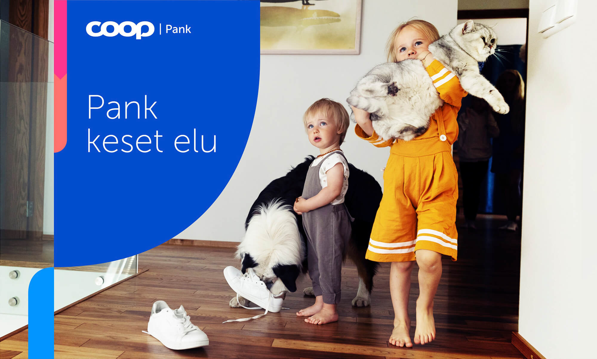
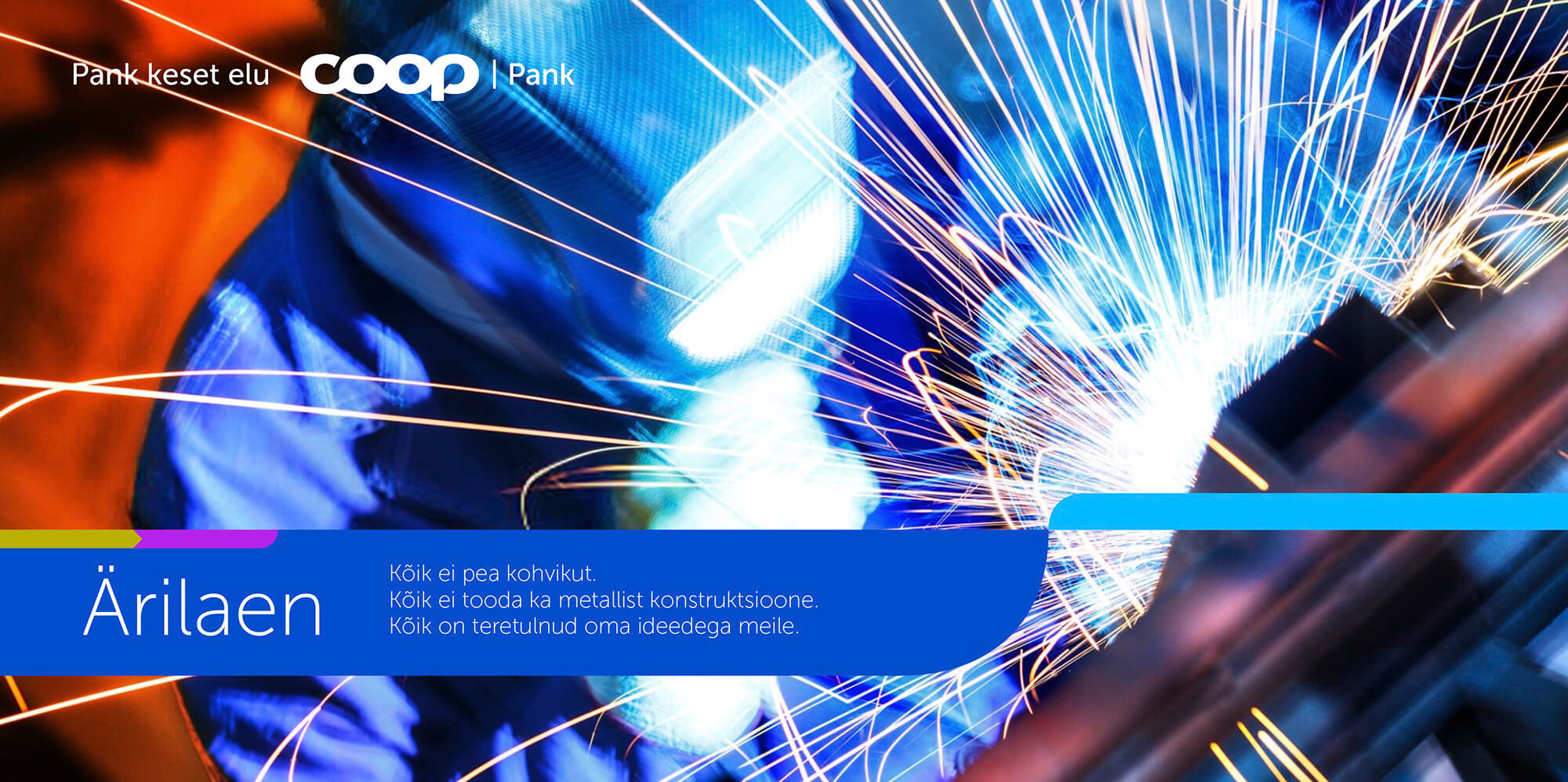
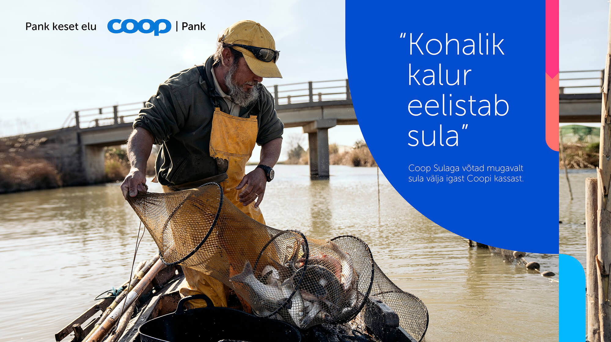
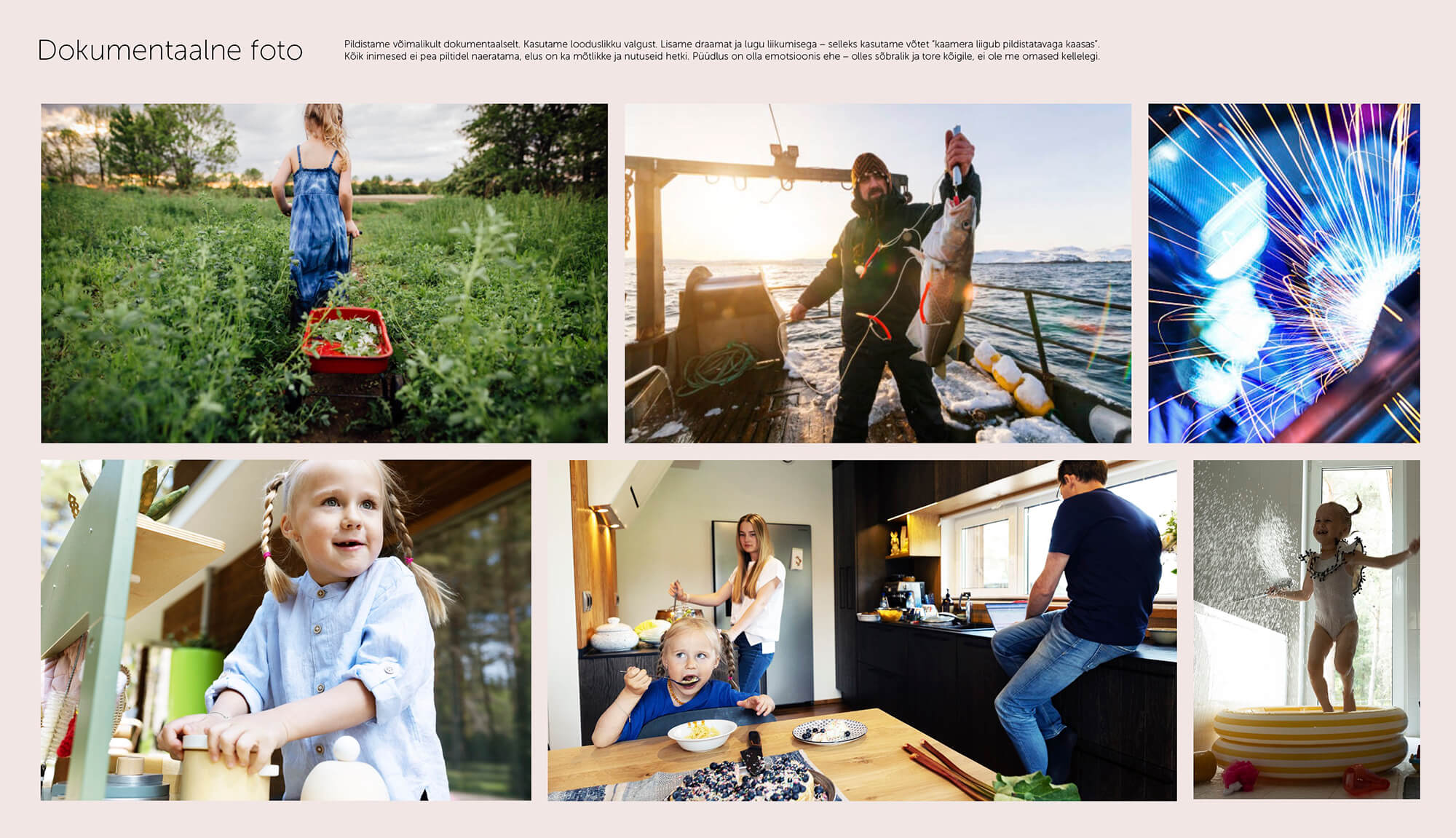
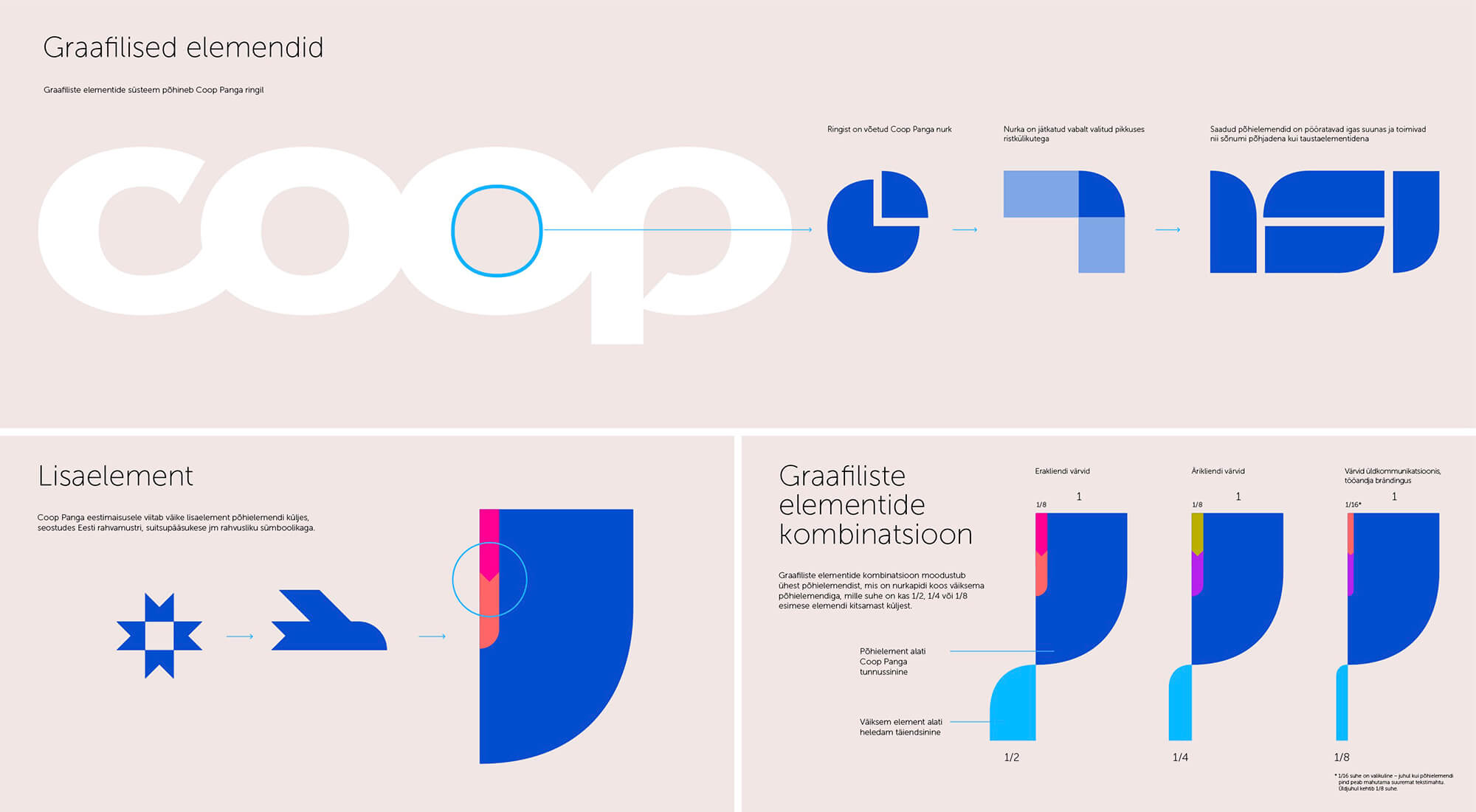
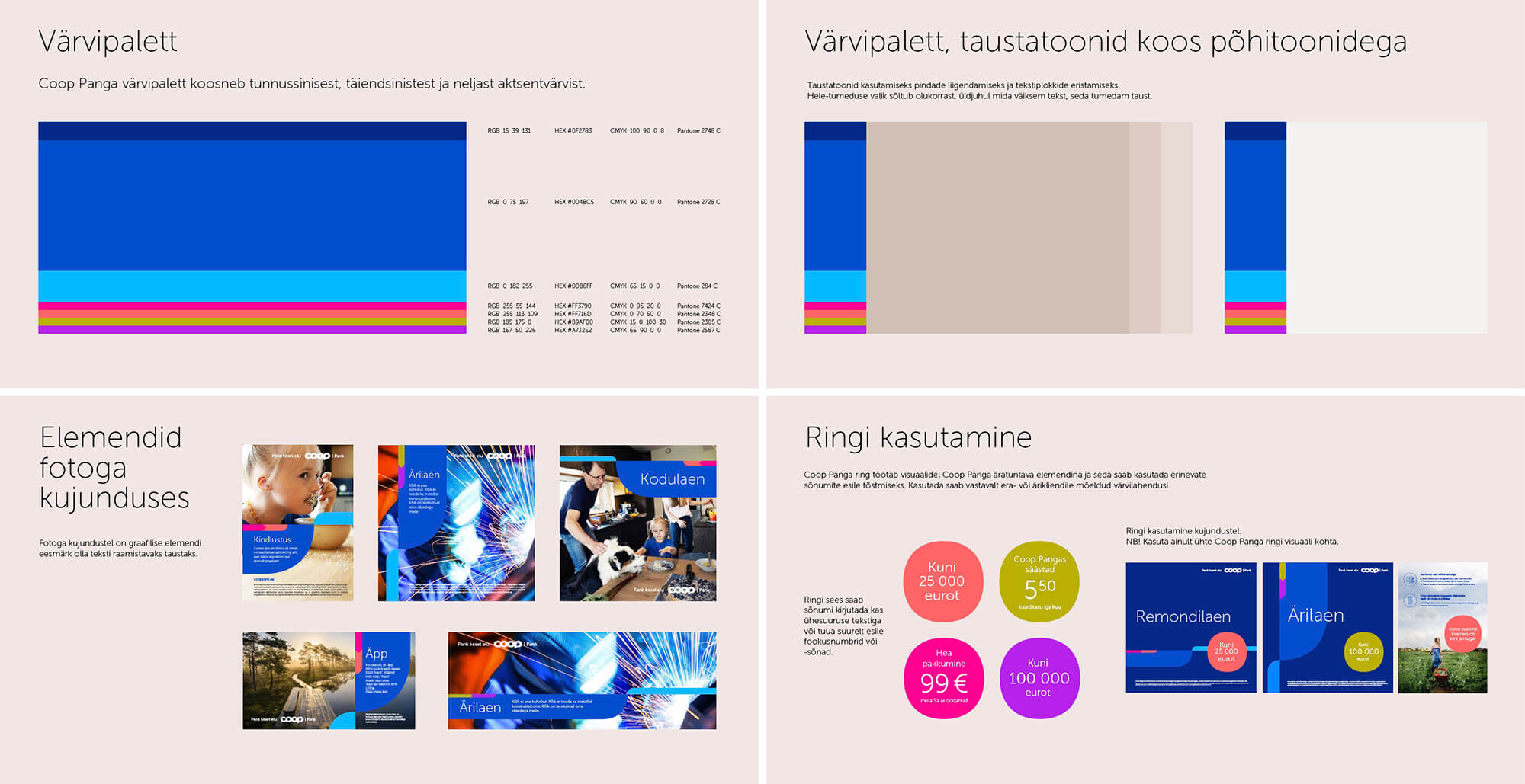
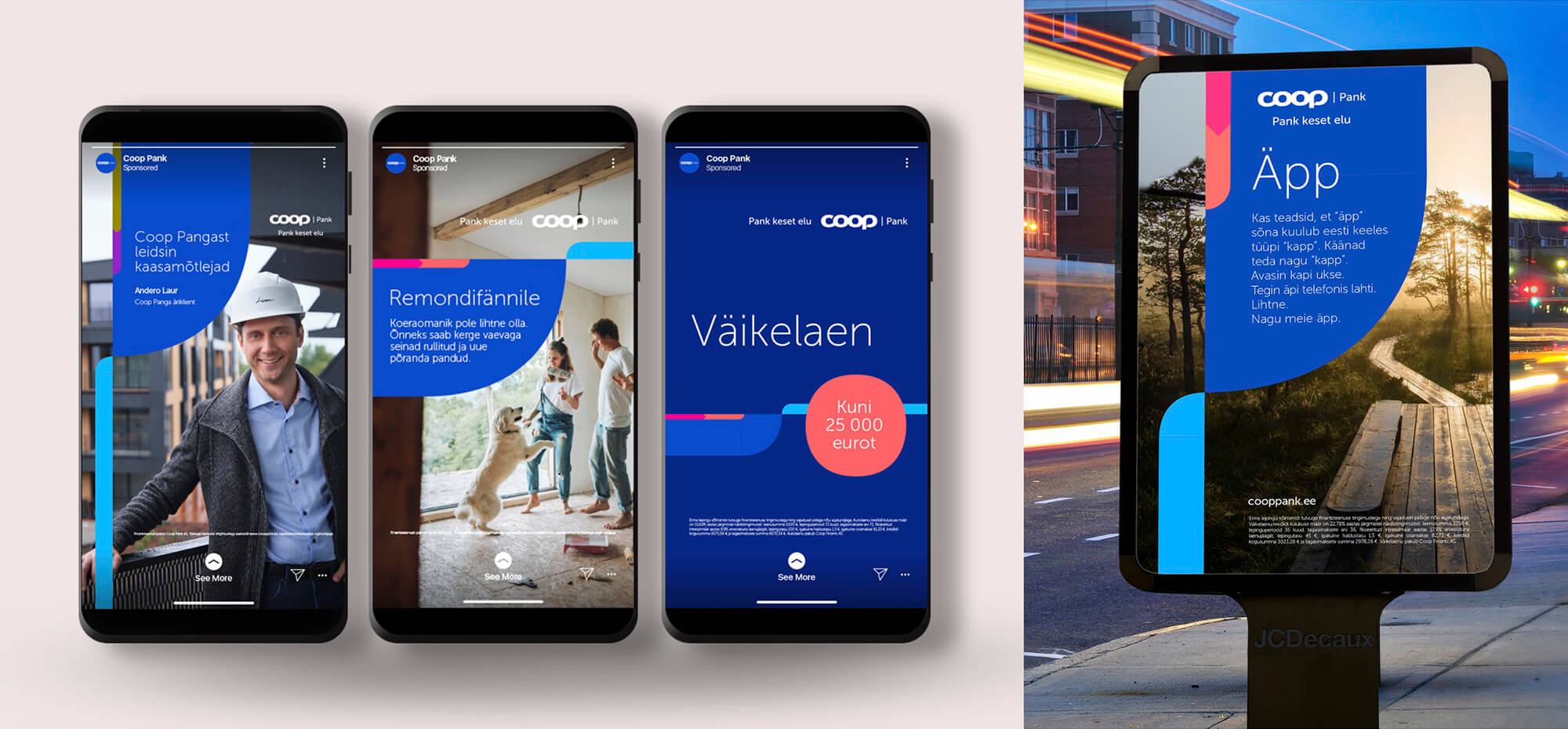
We brought energy, colour, Estonian essence and modernity into a graphic language and we made the visual language more documentary and lifelike. The authenticity is also created by humorously worded messages in a quotation style, which communicate the product while reflecting the everyday life of the consumer. Why all this? Coop Pank wants to be more bank-like, so through rebranding, we made the advertising language more credible and visually attractive.

Previous
Next

Recently Baked

Valio Song and Dance Festival special series packages

Campaign, Design / Logo, Packaging Design

Riding the wave of good energy!

Campaign, Digital

Finnlog spring campaign

Campaign

Taffel “Movie Nights”

Campaign, TVC, Video / Film

Premia Eriti Rammus

Campaign, Digital, Outdoor, Photos and illustrations

Hepsor illustrations

Digital, Photos and illustrations

Premia “Unpack your summer”

Campaign, Digital, Outdoor

Tõnismäe Pharmacy 100

Campaign, Outdoor

Coop Pank calendar 2025

Photos and illustrations

Salvest Prestó’s relaunch campaign

Campaign, Digital, Social Media

  • What we do
  • Portfolio
  • Clients
  • What we do
  • Portfolio
  • Clients

For general enquiries

+372 627 0070
division@division.ee

our ADDRESS

Kursi 3
Tallinn, 10415, Estonia

View on map

social

Instagram
Facebook
Youtube
© Division, 2020. All rights reserved.
  • ENG
  • EST
  • What we do
  • Portfolio
  • Clients
  • Contact
  • What we do
  • Portfolio
  • Clients
  • Contact
  • ENG
  • EST
  • What we do
  • Portfolio
  • Clients
  • Contact
  • What we do
  • Portfolio
  • Clients
  • Contact