• Design / Logo

Logo design for Well Done


  • 2023

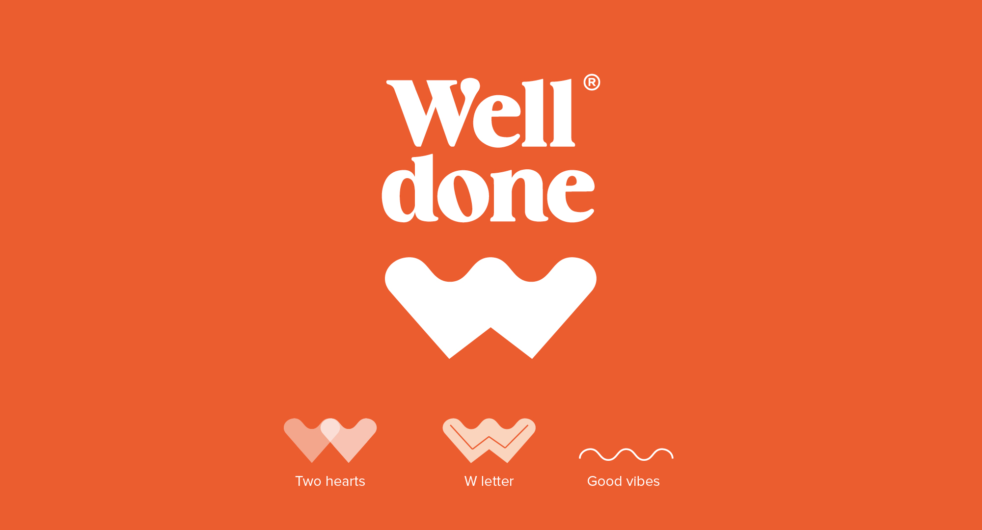
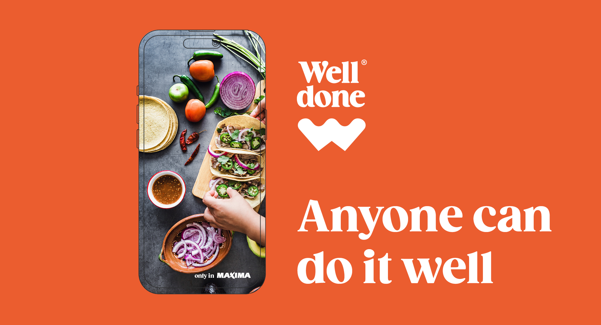
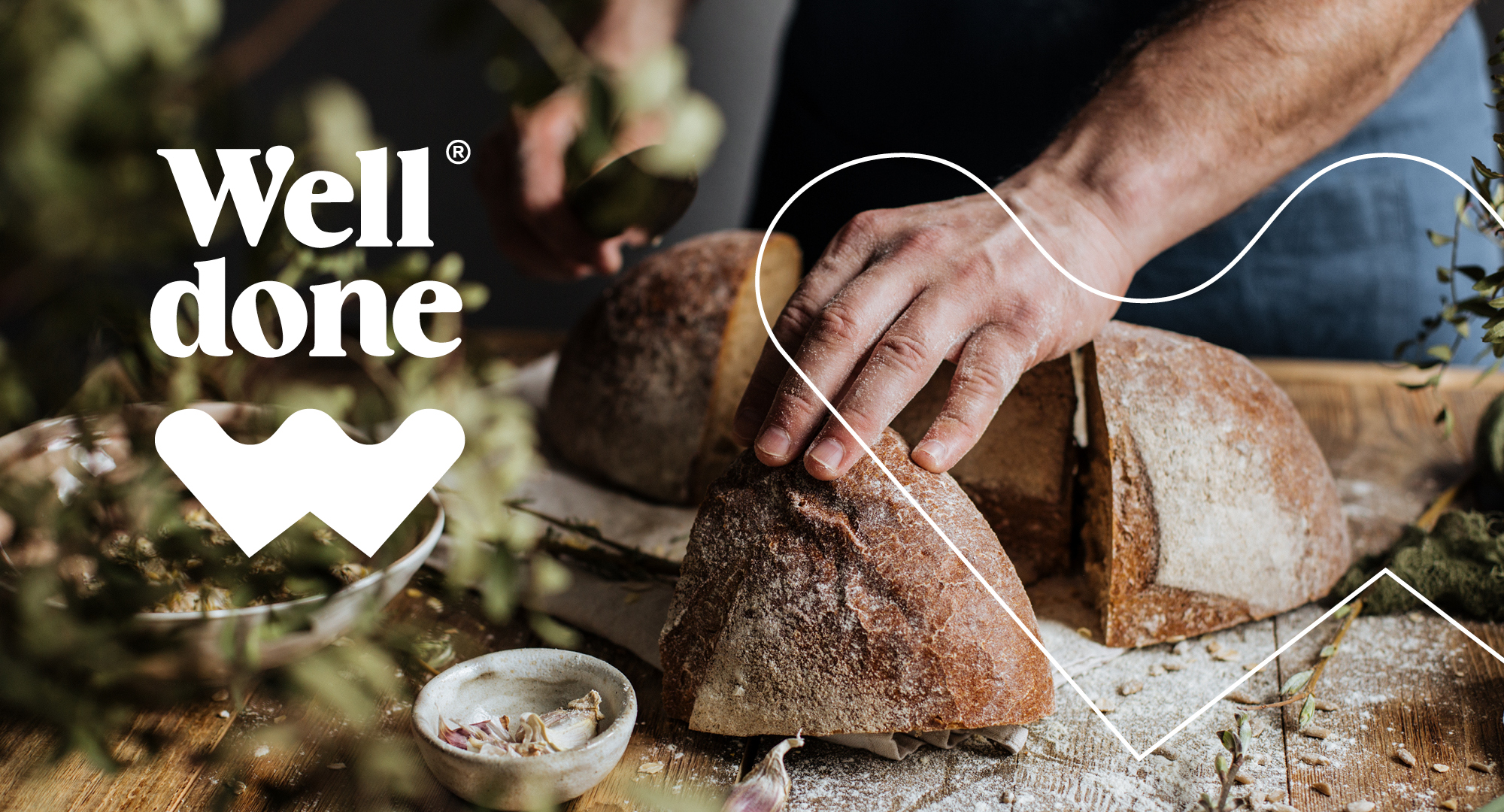
Two hearts – joined as one. Our mutual love for food. The love that’s poured into making the products and the love your family shares sitting around the dinner table. The shape of the letter W becomes the iconic element for the brand. A powerful symbol that is universal but unique to Well Done at the same time.

The mixture of straight and correct lines are used to bring out the clear commitment for quality and precision that is applied to production and softer curves which express the brand’s emotional values. Combined together it results in good vibes, expressing the undeniable fact that good food brings a good mood.

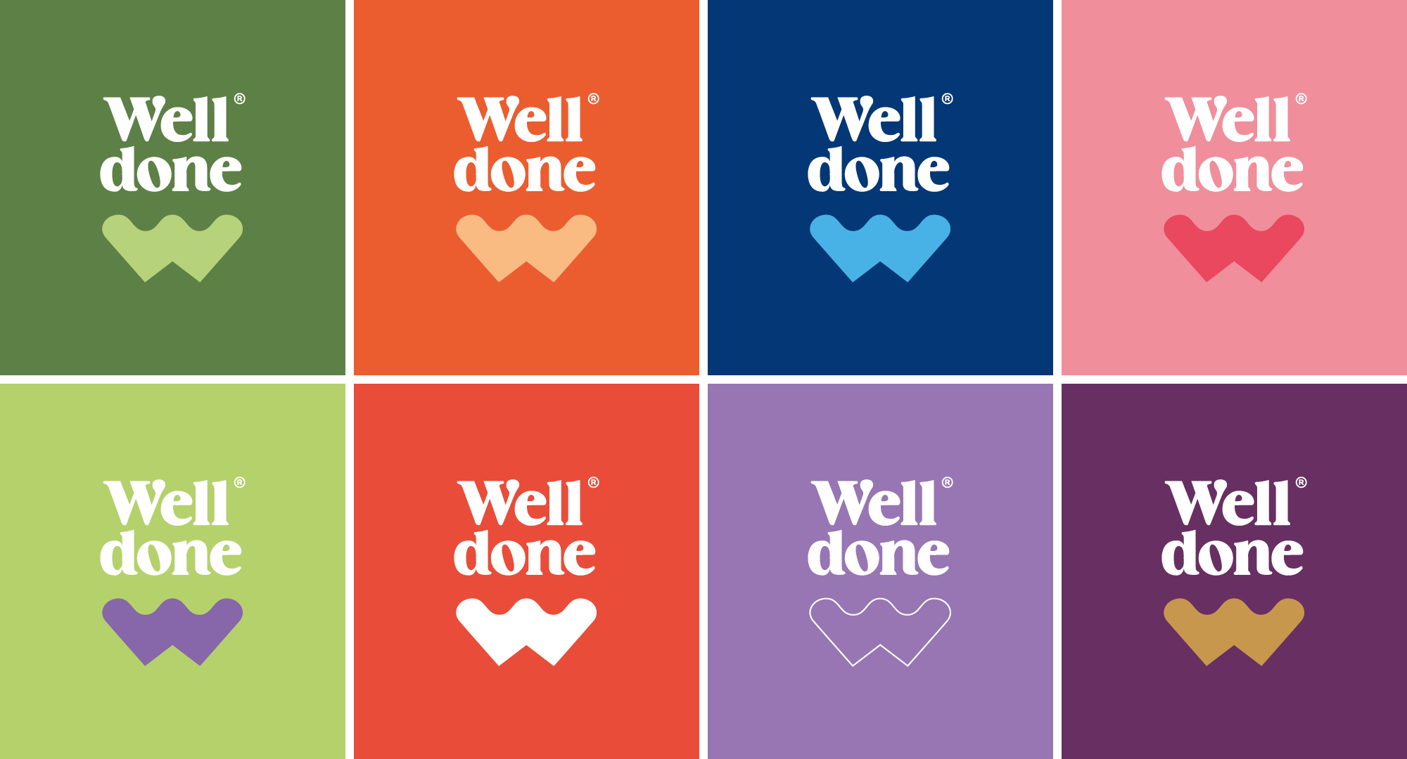
The pièce de résistance is the concept behind our colorway. One that changes and adapts to fit all the different product groups, package design tones and characteristics of the products themselves, that you can find in Well Done’s selection.

We present to you – a Well Done logo.
Bon appétit!

Previous
Next

Recently Baked

Enchanted Winter Porter

Packaging Design

Marmiton Gingerbread Campaign

Campaign

Saku KISS Cocktails

Packaging Design

Maxima’s Christmas campaign 2025

Campaign, TVC, Video / Film

Saku Läänekallas

Packaging Design

Hakkab Looma 2050

Campaign, Digital, Outdoor

Alma Spreadable Cheese Packaging – new product, new look, new flavors

Packaging Design

Saku Jaanikalender 2025

Pangaliit “Scammers wear many masks”

Campaign, Video / Film

ALMA New spreadable cheese TVC

  • What we do
  • Portfolio
  • Clients
  • What we do
  • Portfolio
  • Clients

For general enquiries

+372 627 0070
division@division.ee

our ADDRESS

Kursi 3
Tallinn, 10415, Estonia

View on map

social

Instagram
Facebook
Youtube
© Division, 2020. All rights reserved.
  • ENG
  • EST
  • What we do
  • Portfolio
  • Clients
  • Contact
  • What we do
  • Portfolio
  • Clients
  • Contact
  • ENG
  • EST
  • What we do
  • Portfolio
  • Clients
  • Contact
  • What we do
  • Portfolio
  • Clients
  • Contact