• Design / Logo / Photos and illustrations

Identity for Scandium Real Estate Developer

  • 2021

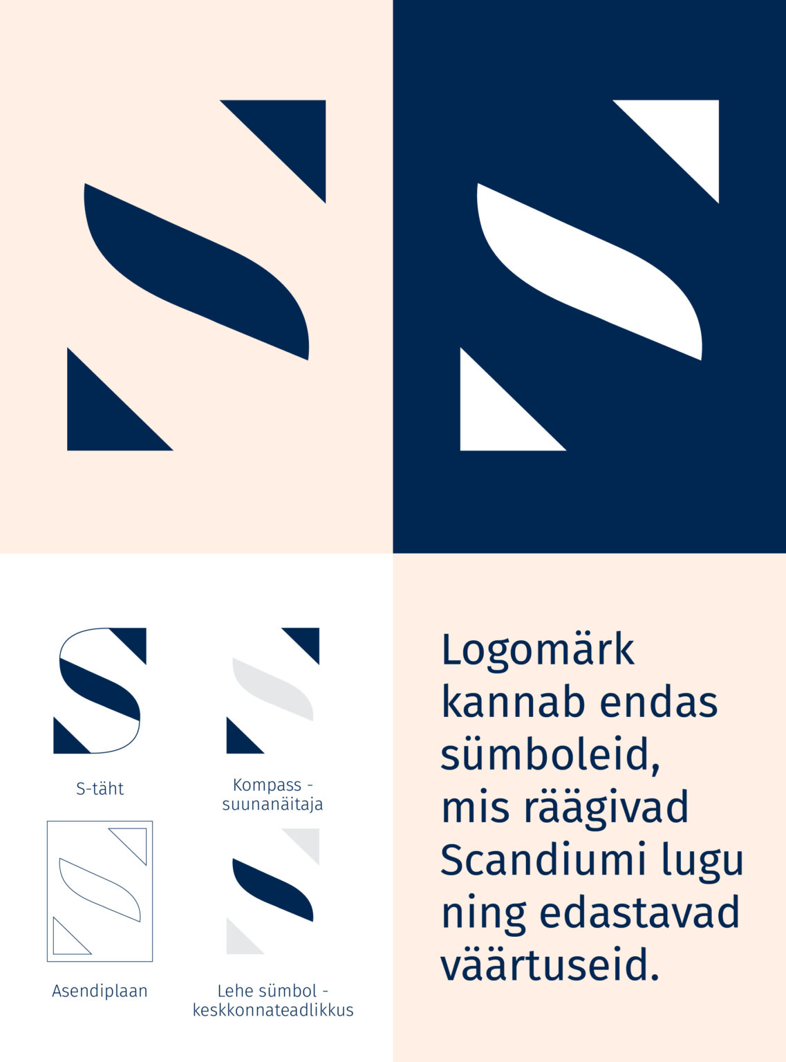
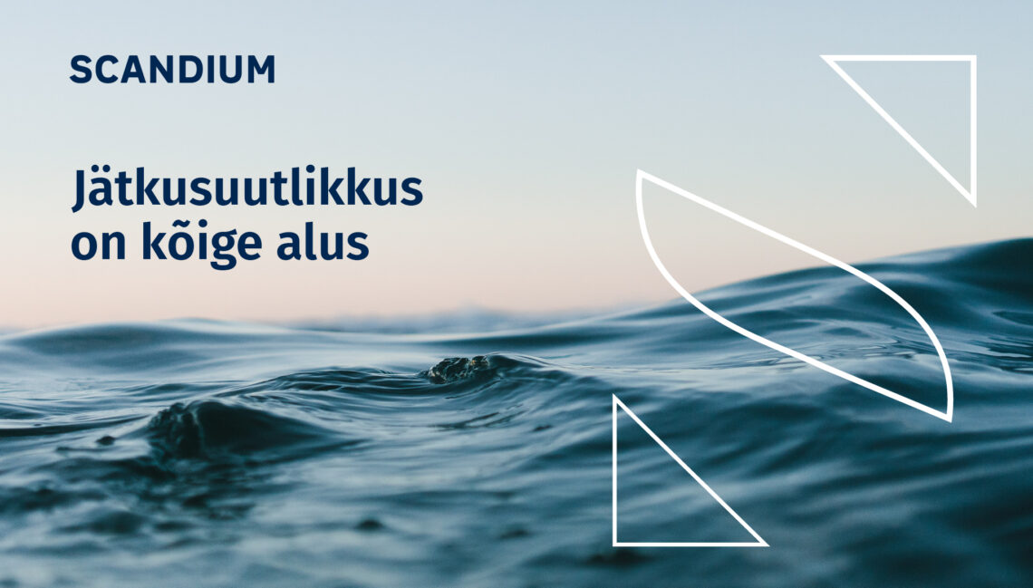
The Scandium logo carries symbols: the letter S, a compass – a direction indicator, a position plan and a leaf symbol. The elements in the logo tell the story of Scandium and carry its convey values.
The stylized letter S is a representative and clear reference to the name Scandium, being as creative and prominent as the architecture offered by the company.
The symbol of the leaf embedded in the logo is related to the nature of Scandium’s “green tiger” to offer environmentally friendly solutions and create a greener living environment.
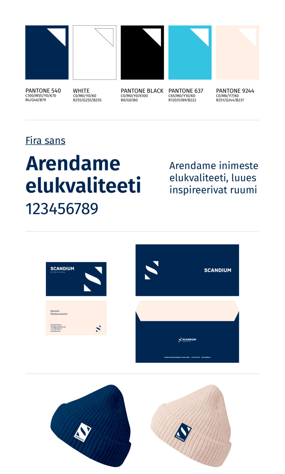
The main color of Scandium’s identity is dark blue, expressing reliability, dignity and stability – both in business relationships and in lasting real estate solutions.

Previous
Next

Recently Baked

Valio Alma milk TVC

TVC

A Ray of Sunshine: The New Alma Spring Curd Snack!

Packaging Design

Alma Curd Snacks Consumer Campaign TVC

TVC, Video / Film

The new packaging of Alma’s holiday kohuke

Packaging Design

Enchanted Winter Porter

Packaging Design

Marmiton Gingerbread Campaign

Campaign

Saku KISS Cocktails

Packaging Design

Maxima’s Christmas campaign 2025

Campaign, TVC, Video / Film

Saku Läänekallas

Packaging Design

Hakkab Looma 2050

Campaign, Digital, Outdoor

  • What we do
  • Portfolio
  • Clients
  • What we do
  • Portfolio
  • Clients

For general enquiries

+372 627 0070
division@division.ee

our ADDRESS

Kursi 3
Tallinn, 10415, Estonia

View on map

social

Instagram
Facebook
Youtube
© Division, 2020. All rights reserved.
  • ENG
  • EST
  • What we do
  • Portfolio
  • Clients
  • Contact
  • What we do
  • Portfolio
  • Clients
  • Contact
  • ENG
  • EST
  • What we do
  • Portfolio
  • Clients
  • Contact
  • What we do
  • Portfolio
  • Clients
  • Contact